How to Predict the Next Team to Score Using Live Possession Heat Maps
Want expert predictions delivered daily?
Get free tips on Telegram or upgrade to Premium.
Predicting the next team to score in a live football match can feel incredibly difficult, especially when odds change every few seconds. One moment a team appears to be dominating, and the next the market shifts before you've even had time to react. Many bettors rely on basic statistics such as possession percentages, shots on target, or dangerous attacks, but these numbers often lag behind what is actually happening on the pitch.
This is where live possession heat maps can become a valuable tool. Instead of simply showing who has the ball, they reveal where possession is occurring and which team is applying meaningful pressure. When used correctly, heat maps provide a deeper understanding of momentum, attacking intent, and territorial dominance, helping bettors make more informed decisions about which team is most likely to score next.
What Are Live Possession Heat Maps?
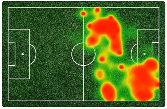
Live possession heat maps are visual representations of where the ball has been controlled during a football match. They use colour gradients to show areas of activity, with cooler colours representing lower involvement and warmer colours highlighting areas where possession has been concentrated.
The purpose of these maps is to transform large amounts of data into an easy-to-understand visual format. Instead of reading through dozens of statistics, you can quickly identify which team is controlling important areas of the pitch. This makes it easier to understand the true flow of the game.
Most modern data providers use advanced tracking technology to generate these visualisations. Every pass, touch, carry, and movement contributes to the final image, creating a detailed snapshot of territorial control throughout the match.
Why Traditional Statistics Can Be Misleading
Many live bettors focus heavily on statistics such as possession percentages and shots on target. While these metrics are useful, they do not always tell the full story. A team can dominate possession without creating meaningful scoring opportunities.
For example, a side may enjoy 65% possession but spend most of the match passing the ball around midfield. Another team might have only 35% possession but repeatedly penetrate dangerous attacking areas. In that situation, the lower-possession team could actually be more likely to score next.
Heat maps help reveal these differences. Rather than focusing solely on how much possession a team has, they show where that possession occurs and whether it is creating genuine attacking pressure.
Understanding Heat Map Colours
The colours displayed on a heat map are not random. They represent the intensity of activity within different parts of the pitch. Learning how to interpret these colours is the first step toward using heat maps effectively.
Warm colours such as orange and red usually indicate areas where possession has been concentrated for extended periods. These zones often represent attacking pressure, sustained build-up play, or repeated incursions into dangerous areas.
Cooler colours such as blue and green indicate lower levels of activity. While these areas still matter, they generally suggest less influence on immediate scoring opportunities. The contrast between hot and cold zones helps bettors identify which team is controlling the most important areas of the field.
Why Location Matters More Than Possession Percentage
Not all possession is equally valuable. A team circulating the ball around its own defence may inflate possession statistics without creating any real threat. In contrast, sustained possession around the opposition penalty area often leads to chances, corners, and shots.
This is why location matters so much. A heat map showing intense activity inside the attacking third is often more useful than a simple possession percentage. It provides context that traditional statistics frequently miss.
The closer a team consistently operates to the opponent's goal, the greater the probability of creating scoring opportunities. Heat maps make this relationship easier to identify in real time.
Identifying Dangerous Attacking Pressure
One of the most useful applications of heat maps is identifying sustained attacking pressure. Teams rarely score completely at random. Most goals are preceded by periods of territorial dominance and repeated attacks.
When a heat map begins showing concentrated activity around the penalty area, it often indicates that the attacking side is forcing the opposition deeper into their defensive shape. This pressure can eventually lead to mistakes, fouls, corners, or high-quality chances.
The key is not to react to a single attack. Instead, look for repeated patterns over several minutes. Consistent pressure is generally a stronger indicator of future goals than isolated moments of attacking play.
The Importance of Penalty Area Activity
The most valuable area on any football heat map is the opposition penalty box. Possession inside this zone is significantly more likely to result in goals than possession elsewhere on the pitch.
When a team repeatedly enters the penalty area, it suggests they are successfully progressing through the opposition's defensive structure. This often leads to shots, cutbacks, rebounds, and set-piece opportunities.
A deep red area inside the penalty box is one of the strongest visual indicators that a team may be close to scoring. While it does not guarantee a goal, it represents the type of territorial dominance that frequently precedes one.
Combining Heat Maps With Other Live Data
Heat maps become even more powerful when combined with other live statistics. Rather than relying on a single source of information, bettors can create a more complete picture of the match.
Useful supporting metrics include:
- Shots on target
- Expected goals (xG)
- Corner kicks
- Dangerous attacks
- Crosses completed
- Possession in the final third
Each statistic adds context to the visual information provided by the heat map. For example, intense attacking heat combined with rising xG values creates a much stronger case for a goal than either metric alone.
Using multiple indicators helps reduce false signals and improves decision-making.
Understanding Momentum Through Heat Maps
Momentum is one of the most discussed concepts in football betting, but it is often difficult to quantify. Heat maps provide a visual method of identifying momentum shifts as they happen.
When one team suddenly begins dominating possession in advanced areas, the heat map changes accordingly. This shift often reflects tactical adjustments, increased confidence, or fatigue from the opposing side.
Observing these changes in real time allows bettors to identify emerging trends before they become fully reflected in the betting market. This can create valuable opportunities for those who react quickly and intelligently.
Spotting Tactical Changes
Football managers regularly adjust tactics during matches. Substitutions, formation changes, and strategic instructions can dramatically alter the flow of a game. Heat maps often reveal these adjustments before they become obvious through traditional statistics.
For example, introducing an attacking winger may suddenly increase activity down one flank. A switch to a more aggressive formation may result in greater possession around the opposition penalty area. These shifts are often visible on the heat map almost immediately.
Recognising tactical changes early can help bettors anticipate future scoring opportunities rather than simply reacting after they occur.
Practical Example: Predicting the Next Goal
Imagine Team A has enjoyed most of the possession during a match, but their heat map shows activity concentrated around midfield. Team B, despite having less possession overall, has generated repeated pressure inside the attacking third.
Over the last ten minutes, Team B's heat map begins showing intense red zones around the penalty area. Their corner count is increasing, and their xG has risen steadily. At the same time, Team A is struggling to move the ball beyond the halfway line.
In this scenario, Team B may be the stronger candidate to score next despite having less overall possession. The heat map provides context that basic possession statistics fail to capture.
Common Mistakes When Using Heat Maps
While heat maps are useful, they are not infallible. One common mistake is assuming that every period of pressure will result in a goal. Football remains unpredictable, and dominant teams can still fail to convert chances.
Another mistake is focusing on short-term activity. A brief spell of pressure may look impressive visually, but sustained patterns are generally more reliable. It is important to distinguish between temporary attacks and genuine territorial control.
Finally, avoid using heat maps in isolation. Combining them with supporting metrics creates a more balanced and reliable analytical framework.
5 Best Platforms for Viewing Live Heat Maps
Having access to quality heat map data can significantly improve your ability to identify momentum shifts and predict the next team to score. While no platform is perfect, several providers offer reliable live visualisations that can help bettors understand where the game is being played and which team is applying the most pressure.
The key is not simply choosing a platform with heat maps, but finding one that combines visual data with useful supporting statistics such as shots, expected goals (xG), dangerous attacks, possession trends, and player performance metrics. Using these tools together creates a much clearer picture of the match than relying on one metric alone.
1. SofaScore
SofaScore is one of the most popular platforms among football bettors because it combines live heat maps with a wide range of real-time statistics. The platform updates quickly and provides visual momentum charts that make it easy to identify which team is controlling the game.
One of SofaScore's biggest strengths is its attack momentum feature. This visual indicator often aligns closely with heat map activity, helping bettors identify periods where a team is building sustained pressure around the opposition penalty area. For live betting, this combination can be extremely useful when assessing next-goal markets.
2. Flashscore
Flashscore is widely known for its fast score updates, but it also provides useful match statistics that complement heat map analysis. While its visualisations are not always as detailed as some specialist platforms, it remains a valuable resource for monitoring live games.
Many bettors use Flashscore alongside another platform because of its speed. When combined with heat map data from elsewhere, it provides a quick way to track corners, shots on target, cards, substitutions, and other events that influence scoring probability.
3. FotMob
FotMob offers some of the most user-friendly football data available. Its clean interface makes it easy to track live match momentum, player ratings, expected goals, and possession patterns throughout a game.
The platform is particularly useful for identifying which players are driving attacking moves. If a team's most dangerous attackers are consistently involved in advanced areas shown on the heat map, it can strengthen the case for backing that team to score next. FotMob's combination of visual and statistical data makes it a favourite among data-driven bettors.
4. WhoScored
WhoScored is best known for its detailed statistical breakdowns and player performance analysis. While many people use it for pre-match research, its live data can also support game state analysis during matches.
One advantage of WhoScored is the depth of its player-level information. You can see which players are creating chances, completing key passes, and operating in dangerous areas of the pitch. When these insights are combined with heat map activity, they provide a more complete understanding of where attacking threats are coming from.
5. Opta-Powered Platforms
Many professional sports websites and betting analytics services use data supplied by Opta. These platforms often provide some of the most accurate and detailed heat maps available because they are built using advanced event tracking systems.
Opta-powered services typically offer deeper insights into possession zones, passing networks, expected goals, and shot quality. While some of these platforms require subscriptions, they are often preferred by serious bettors who want the highest-quality data available for live analysis.
Which Platform Is Best?
There is no single best platform for every bettor. SofaScore is excellent for visual momentum and live heat maps, Flashscore is known for speed, FotMob provides strong all-around analysis, WhoScored excels in player statistics, and Opta-powered services offer professional-grade data.
Many experienced bettors actually use two or three platforms simultaneously. This allows them to cross-reference information and build a more complete view of the match. The more accurately you can understand the current game state, the better your chances of identifying value in next-team-to-score markets before the odds fully adjust.
Conclusion
Live possession heat maps offer a powerful way to analyse football matches beyond traditional statistics. By showing where possession occurs and highlighting areas of sustained pressure, they provide valuable insight into which team is genuinely controlling the game. This information can help bettors identify likely scoring opportunities before the market fully adjusts.
When combined with supporting metrics such as expected goals, shots on target, and corner counts, heat maps become an even more effective predictive tool. While they should never be used in isolation, they provide a deeper understanding of match dynamics and can significantly improve live betting analysis. For bettors looking to predict the next team to score more accurately, learning to interpret possession heat maps is a skill well worth developing.
? Frequently Asked Questions
How accurate are live possession heat maps for predicting goals? ⌄
Do heat maps account for counter-attacks or fast breaks? ⌄
What is the typical delay on live heat map data from betting platforms? ⌄
Can I use live heat maps for sports other than football? ⌄
Why do live betting lines suspend during VAR checks or major incidents? ⌄
Related Articles
- How to Fix Geolocation Tracking Failures on Live Betting Mobile Apps in the UK
- How Red Zone Efficiency Ratings Drive Live Point Spread Shifts in Football Betting
- Why Australian Live Bets Require a Phone Call: Understanding the Legal Mandate
- How to Predict MLB Over Totals Using Pitch Count Data
- How to Bet Live After a Missed Penalty in Soccer
- How to Bet NFL Drive Result Props Using Live Game Data
- How to Bet NBA Garbage Time Point Spreads for Live Betting Value
📬 Free Daily Predictions
Get expert picks delivered to your inbox every morning.